Case Study
Conversational AI through webchat
How I set up a powerful framework which separates capable front-end UI components from business logic, which upon integration with the customer data store creates a highly personalized website experience for each visitor.
Role: Product manager and designer, business analyst, design systems contributor
Premise
Reva is a B2B2C startup based in Silicon Valley, that makes data-conscious CRM software for the multi-family real estate domain. For its multiple customers, Reva's product helps leasing agents at properties with bringing in leads through various marketing channels and maturing them from contact to contract, and helps property managers with actionable insights through a comprehensive analytics dashboard.
Goals and objectives
Most of the website chatbots we looked at, in multifamily real-estate and a few other verticals, had a tendency to mimic existing website functionality. A lot of them were -
static and inflexible (does the same thing regardless of property, or whether the consumer interacting with the chatbot had previous contact with the property),
context-ignorant (asks to book a tour again while pretending that another tour wasn't just booked on the same chatbot session, mere minutes ago), and
broke easily (poor error recovery meant that consumers often had to start entire flows from scratch).
Compared to a website navigation experience, the experience inside a chatbot is more suited to progressive disclosure. Because of its size and therefore, the need to bring up a focused and essential set of options at each turn, we sensed a huge opportunity to apply rigor to how these options are calculated. In other words, can we pinpoint what each visitor is looking to do on the website and personalize their experience at scale?
Business, product, and design considerations
Because of the flaws we found in existing web chatbots, we deduced that placing business logic in code will -
make the chatbot a mess to manage especially if we're looking to make them flexible,
will exclude from the process, people who are strong in defining business rules, but need technical nous to understand code, and
make the bot brittle because gaps in business logic are hard to find in code.
Through a principled and deliberate application of separation of concerns, we designed a scalable framework where business logic would use flexible front-end components to render the next node presented to the consumer. Because business logic would not be intertwined in code, if a customer wanted to add a new path (say, to include new restrictions in the face of a global pandemic) that used the existing UI components and data store, then they can publish this new path with zero engineering effort.
Taking this one-step further, since the process of sales can also vary with region or property (or even down to a single building inside a property), we also designed the framework to abstract content from code. This architectural decision would not only avoid the nightmare that comes with editing content from inside code, but would also personalize the webchat with another dimension, one based on language (internationalization) and locale-specific peculiarities (localization).
Outcomes and results
For key consumer-centric use cases on the existing marketing websites (like creating a quote, scheduling a tour, exploring the community and the neighborhood, and contacting an agent), I had designed a fixed set of front-end message templates to keep the scope narrow and focused. I had also specified how these templates function under different UI and data-specific events.
I had also defined the shape of the data object for front-end to interpret and render the components accordingly. Finally, I extended the website's UI and analytics components to work inside a webchat context.

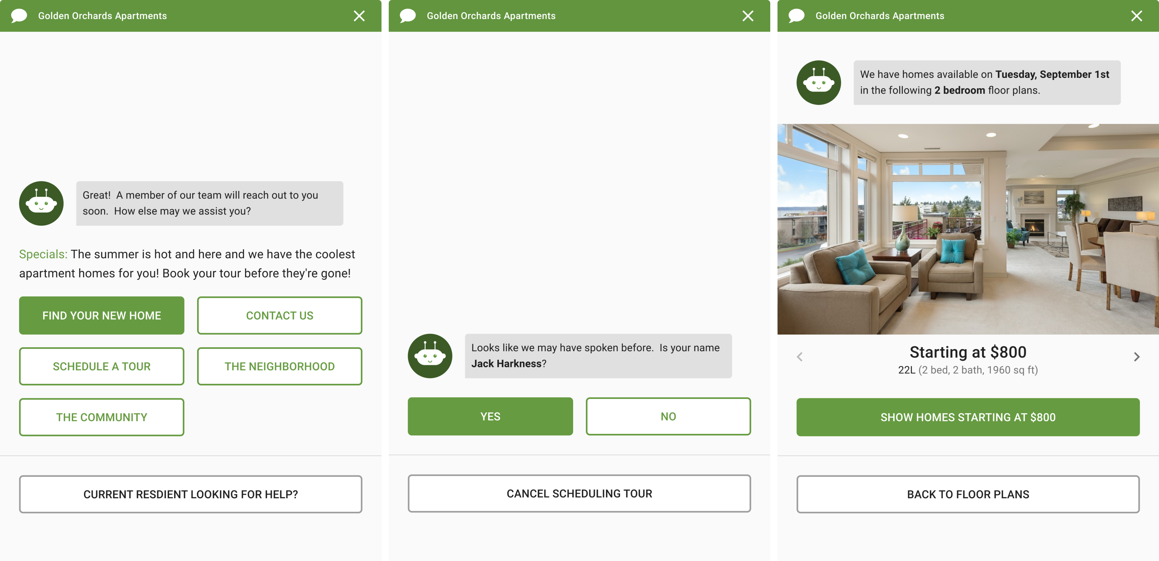
Description: To build a chatbot through a deliberate application of separation of concerns, the front-end components also needed to be modular and reusable. In order to avoid building too many new components from scratch, I translated how users currently use the website and converted them into templates that could be used for a webchat. Above are a few such examples - (Left) Menu and dropdowns become a single-select 2-column menu (1-column for widths between 320-480dp widths) reusing buttons from the existing website components which also carry with them the theme set for the current website. (Middle) Dialogs with a binary response-set also get converted to a single-select menu, which can be used for validating previously given information. (Right) Because choices need not always be on textual components, I introduced a compound component that combines the existing website carousel with the button that reflects the description of the current item in view.

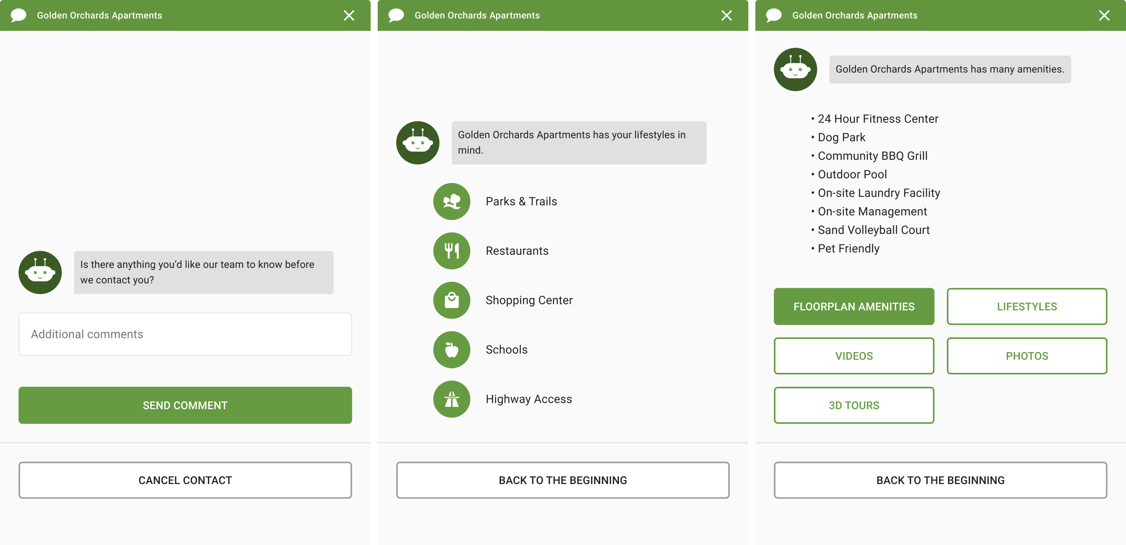
Description: We also considered the possibilities that some templates may be deployed at a terminal node in which case the user would need to navigate one-level up (the middle template above only has a back-to-beginning option). In general, we didn't consider the templates to be exhaustive in and of themselves, but rather composite representations in which users need to see information and/or act upon them. So a bulleted unordered list template (rightmost) also carries a single-select text option for a user to directly navigate to its sibling nodes in the tree. I'll dive deeper into the considerations made for the text-input template (leftmost) later in this case study.

Description: Some of these message templates were straightforward extensions of what was already available as components for the marketing websites for properties - like map (leftmost), carousel for apartment pictures, videos, and 3D tours (middle), and widgets like date-picker and time-picker (rightmost) which needed some minor modifications to be appropriate for a webchat context. A key difference between treating the single-select media template as a mere combination of carousel and a single-select text template was that the single-select media's options changed based on what is currently in view. This is to distinguish it from use cases where the photos/videos/3D tour displayed needn't have any influence on the menu below.

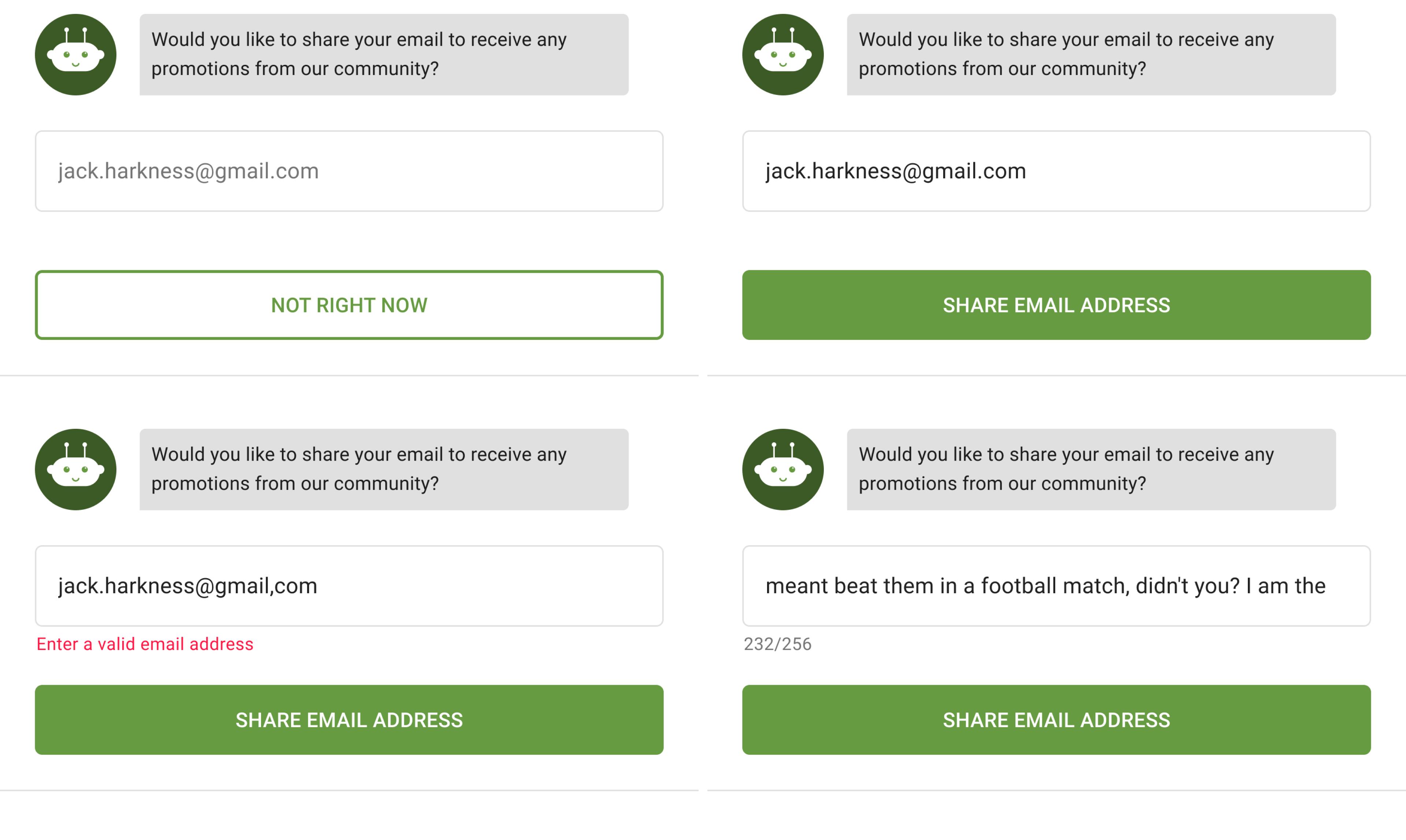
Description: By judging how differently a text-input can appear, we broke it down into a set of levers we can change. Is it a single-line text input or multi-line? Is it a mandatory field for the user to fill to move forward, or is it optional? How would the button change in each case and what kind of message would it pass to the conversation stack, representing the consumer's choice? What would validation look like and how do you represent character count if there is a limitation set? By using these levers, I was able to make a design for each combinatorial representing the possible ways business logic would want the button to look and behave like, and for front-end development to account for all of these possibilities, without failing. Shown above are all states for single-line optional text input states.
Team credits
Josh Hall (VP of Product) had a pivotal role to play in this endeavor at multiple stages. In addition to leading the product architecture, he had led the development of property's marketing websites and making them available through Reva. The underlying component, widget, and analytics setup for the marketing websites were fundamental to this product. In my absence (beginning May 2021), he's been leading the day-to-day development of the chatbot.
Ryan Krochko (front-end development) and Kevin Moller (business rules and vocabulary definition) were in the trenches with me on a daily basis, as we hashed out the finer details of how the bot should work for the short and the long-term. Together, we were able to catch edge cases that then prompted some of our more granular design decisions.
Christophe Gillette's (VP of Engineering) inputs were the glue that held everything (business logic, UI logic, engineering logic, and the data store) together.
